The weather was picturesque on Oct. 28 in Coronado, a reminder that in many ways, the earth is oblivious to the constant chatter of election season amidst an international health pandemic. A couple, the Slanies, woke up to the slightly chilly but sunny morning, business as usual. The breeze lifted and dropped the large “Trump 2020” flag on their porch, though something else caught their eye outside — a sign on the lawn that they hadn’t installed.
They were one of six calls the Coronado Police Department received that day.
“I’ve never seen anything like this before, where people are so divided and it’s ridiculous,” said Ken Slanie to NBC7 San Diego.
The yard sign read “RACISM LIVES HERE, MAKE AMERICA GREAT AGAIN!” typed and styled identically to Donald Trump’s 2016 election yard signs.
The parodied sign played exactly to its audience by engaging many similar elements of design to the original. Political yard signs have been a tradition for people to showcase their civic pride and activism towards a certain candidate, whether in a local or national election. The signs are more than just a statement, however. In fact, they are an art piece with more meaning behind the candidate’s name, and knowing what to look for can help voters know instantly what the candidate wants to tell you without saying a word.
There are many elements to consider when creating a campaign logo and yard sign — including logos, colors, fonts and symbols. There’s a reason that parodies like the “Racism Lives Here” signs are instantly identifiable. Trump’s 2016 campaign signs are ubiquitous. Although the fonts didn’t match Trump’s 2016 campaign, the signs imitated the composition, colors, five stars and red rectangle as well as the popularized slogan. This wasn’t an accident and neither was the original design the sign hoped to mimic.
Presidential campaigns are perhaps the most discussed and most universal. As a result, campaign art is designed to represent that idea. Both candidates are using red, white and blue to evoke a sense of patriotism, an artistic attempt to imply a unified nation under that specific candidate. This color scheme is understandably very popular in both national and local elections.
Often, the color red is associated with the Republican Party and blue with the Democratic Party. This used to be reversed based on old imagery in England, where red was used to represent the liberal parties.
With the advent of color television, these color associations became important for communication but became jumbled, specific to different networks, until the election of 2000. Because the election was so close and there was no clear winner for a few days, cable news channels kept color-coded maps on air and within that short time essentially all merged, establishing Republican states as red and Democratic states as blue.
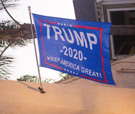
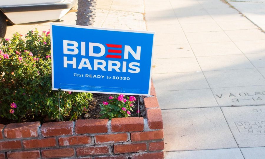
The incumbent ticket uses five stars in the center top of the signage, a callback to Trump’s business background, an identity he leaned on to get elected in 2016. The Joe Biden and Kamala Harris ticket use minimal symbolism or shapes, save for three red stripes in the ‘E’ in Biden. The stripes mimic the ones seen on the American flag. Both campaigns use bold, heavy sans serif fonts, a typeface popularized for its modernity, according to Ross Kimbarovsky, founder and CEO of Crowdspring.
Not only do yard signs for the national election carry art behind the message, but for candidates campaigning in local races in San Diego, it has a major effect on how they portray themselves to voters.
In the California 53rd Congressional District, which San Diego State University is located within, Democrats Georgette Gomez and Sara Jacobs face off for the seat. Despite similarities in policies, values and party – the yard signs of both candidates showcase distinct differences.
Gomez’s campaign incorporates heavy use of the color green. Even though she is not a member of the Green Party, Gomez considers herself a progressive Democrat and has advocated for sustainable policy since the beginning of her career in politics. The use of green is often associated with the earth, with green being found in grass, leaves and nature, and is a call-back to her environmental advocacy.
One of the focal issues of Gomez’s campaign for the 53rd Congressional District and Progressive Democrats is to advocate for climate change. According to her website, she lays out a list of ideas to combat it here in San Diego – from reducing emissions and making investments in clean energy to starting energy-efficient retrofitting of homes and offices.
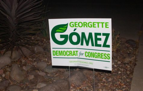
The graphics on her sign are primarily green and involve leaves. Upon first glance, viewers could attribute her as the “earth-friendly” candidate, as someone who cares about the environment and will put climate change at the forefront of her campaign. Also, according to the design group BourneCreative, green represents renewal, freshness and ambition. Gomez is using green to encourage votes to see that she is the candidate who will follow through on ambitious plans, provide a fresh face to the district and spark interest in tackling climate change and other issues.
On the other side, Jacobs incorporates three main colors into her yard signs: black, white and blue.
She uses a plain white background with her first name written in blue text and the last in black text. According to BourneCreative, the use of black in graphic design is meant to represent “strength, seriousness, power and authority.” With her last name in black and considering her wealthy background — her father is the co-founder of Qualcomm— Jacobs’ last name comes from a long line of family members who have experienced authority and positions of power.
With Jacobs using the color of light blue in her first name, it could showcase to voters what her party identity is as a Democrat, though the San Diego County Democratic Party did not endorse Jacobs and criticized her for making misleading statements about her Democratic endorsements. Blue also is known to evoke calmness and stability. If voters see this, it can encourage them to vote for her because she will bring that same sentiment into her office.
Jacobs chose to use white as her background color, serving as a blank backdrop to draw the eyes on her main subject on the sign – which is her name. BourneCreative also states white represents a successful beginning, coolness and simplicity. When people see the color white, it is meant to promote “feelings of fresh beginnings.”
Since Jacobs has never been a politician nor held a seat in the congressional office before, the use of white could tell voters that she is the one to usher in a new beginning in the 53rd Congressional District which has been represented by Susan Davis for almost two decades. Jacobs’ use of white could indicate her wanting to bring in new energy and a fresh start to a district that has had the same representative for 19 years.
In a city with as much political prominence and population density as San Diego, mayoral candidates are taking just as much care in what they are communicating nonverbally. Both mayoral candidates, Barbara Bry and Todd Gloria, are Democrats — and both are campaigning heavily on the fact that they can work independently of their party’s goals.
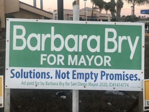
Bry’s campaign uses primarily white with blue and green text, with blue featured much more prominently. Unlike Gomez’s campaign, the use of green is not used here to emphasize Bry’s stance on environmental issues. Most likely, it’s used in the same way that it’s used in marketing. Green is associated with money and can contribute a calming effect associated with wealth and stability.
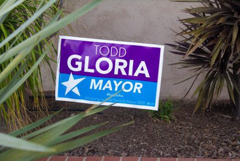
Gloria opted for a heavily blue and purple color scheme (his entire website background is a blue to purple gradient, and the posters and signs associated with Gloria’s campaign feature prominent royal blue and violet shapes and text). Likely, the purple is used in more of a political sense, as a blend of blue and red. By including the blue, Gloria’s campaign emphasizes his Democratic ties but implies that although he still strongly remains in the political blue, he intends to work with his colleagues in red.
Both campaigns use singular stars in their name, a symbol frequently used as it is associated with victory, the American flag and ambition.
Candidates aren’t the only choices voters must consider in the voting booth. Interest, groups, political parties and trade organizations are spending millions of dollars this year on campaigns for and against the 12 propositions on the ballot in California.
The signs in support of or in opposition to these propositions are often independently made, especially if no major interest group or individual is sponsoring a statewide campaign for them. This means that often, the designs for yard signs and promotional materials are less meticulously planned and designed than campaigns for office.
PROP 15: Public School/JC Funding
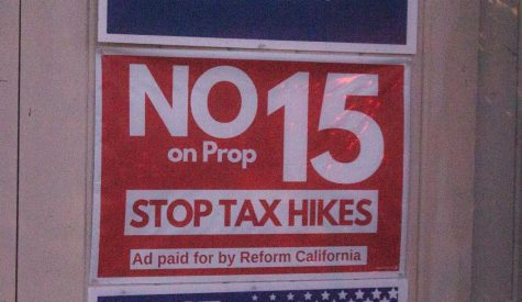
Proposition 15 increases funding for public schools and local governments by increasing property taxes on commercial and industrial property. Naturally, the California Teachers Association is a significant supporter of the proposition, so many of the widespread campaign signs include symbols such as pencils, houses and educational tools to subconsciously connect a “yes” vote to schools and education.
PROP 16: Reverses Prop 209, Reinstates Affirmative Action
A topic of debate since the last decision around affirmative action was made, Yes on Proposition 16 frequently invokes an orange and mint green color scheme — using the state and the colors of its official flower, the golden poppy, which connects the idea of a flourishing California to a “yes” vote.
The Public Policy Institute of California found in an October poll that the majority of voters are likely to vote “no” on this proposition, which would reverse a decision made by voters in 1996 that made affirmative action illegal in government and other public institutions.
The No on Proposition 16 campaigns vary, depending on who sponsored it, but a common yard sign includes bold yellow lettering on a royal blue background. This combination is eye-catching and energizing. It also aligns with the official school colors of University of California campuses such as Los Angeles, Berkeley, San Diego and Irvine.
This association could connect an element of research, prestige or intellect with a “no” vote — as well as remind voters that these are some of the institutions that will be affected by this proposition.
PROP 21: Rent Control by Local Gov’t
Proposition 21 would allow city governments to establish rent control on properties over 15 years old. According to CalMatters, there has been over twice as much money spent on the No on Proposition 21 campaign than the affirmative campaign. This shows in the tidy logo which is used across the state — a navy-blue silhouette of housing with bold sans serif type in red and bright blue. The colors are a modernized version of the typical patriotic color scheme of red, white and blue.
Yes on Proposition 21 features a navy blue background and white lettering with an orange stroke on its yard signs. It uses the symbol of a home with a single orange checkmark, calling for a clear choice. The use of a tag line separates it from many other campaigns — in a world that is constantly moving, even amid a pandemic, taglines are not common in yard signs or posters — it reads “keep families in their homes,” leaning on its pathos to convince voters.
Even in this hyper-polarized and partisan political climate, yard signs adopt many of the same design principles regardless of party affiliation or ideological alignment. One thing that’s for sure, Trump and Biden have created political brands that will be recognized for years to come.


