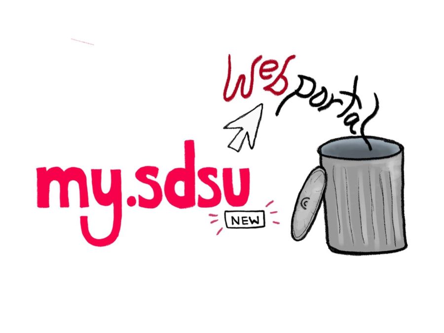
During the fall 2022 semester, San Diego State University transitioned from WebPortal to my.SDSU, an online portal designed to aid students with admission, tuition and grades.
The university has continued its use of my.SDSU since the start of the 2023 spring semester, and since the switch, students and staff alike said they have run into a plethora of problems.
Selena Dao, a junior integrated marketing communications major, is displeased with the navigational ability of my.SDSU.
“Coming in, WebPortal was all I knew and even from the start, it was really easy to get the hang of. A couple clicks and you saw what you needed,” Dao said. “The formatting of (my.SDSU) is weird, and there are a lot more steps for me to take when looking for something specific.”
Devin Hargrett, a sophomore dance major, had less trouble navigating my.SDSU, but questions why the university made this change as he believed WebPortal was perfectly fine.
“(My.SDSU) is not that hard to figure out. It was just very annoying because it was something that just got sprung upon us,” Hargrett said.
Hargrett said he felt lost when my.SDSU was initially implemented and thought there were not enough resources to help navigate through the online portal.
On WebPortal, students were able to see their schedules laid out in a timetable view.
One of the biggest complaints about the switch is that students now have a much harder time seeing how their schedules look weekly. While my.SDSU also has this feature, students claim it’s harder to find which has caused frustration — this has led some to make their own schedules via third-party websites and apps.
On top of that, my.SDSU’s formatting and layout is confusing to students, and with minimal training, individuals such as Hargrett feel they are going into the system blind.
Sophomore criminal justice and international security and conflict resolution major, Manny Carrillo, cites complications with the portal’s layout.
“I didn’t learn that a course had prerequisites until it was my registration date. I blame it on my.SDSU’s navigation system,” Carrillo said. “Also, there is no timetable schedule view of courses on my.SDSU; it was so clutch when planning classes (on WebPortal).”
Some teachers are also expressing problems and inconveniences as students with my.SDSU.
“One of the major issues thus far with the shift to my.SDSU is the waitlist disappearing after the first week of classes,” said Blaine Malcolm, a professor of rhetoric and writing studies. “Without a waitlist, once a spot opens up, I receive 10 plus emails from students asking for a permission number to add the course. It then becomes a headache trying to figure out who needs it more than someone else.”
With WebPortal, students had the security of knowing their position on the waitlist, but now they have to just hope they are fortunate enough to get into the class.
Malcolm further explained that when the semester started, some instructors’ names were listed on the schedules while others were left unlisted, forcing departments to reach out to lecturers individually to inform them of their schedules.
Students and staff said they are hoping for improvements on campus, but after my.SDSU’s initial launch, some say it still has some issues to work through.
Dao explained that she would like to see the page that shows the finances to be better organized and display resources on the same page like WebPortal.
She also explained that she would change the color palette on the homepage to make it match SDSU’s colors. “It’s something specifically for state students, why not make it match the school?”


